
Before sending a proof to client or sending art to the printer:
• Run spell checker
• All files need to be in CMYK mode before sending files to the printer and making the press-ready PDF./X
• Photos in CMYK, saved as a .tif file an properly placed (command + d) in InDesign or (command + e) in Quark
• Exception to the above rule is if you are using a “book-on-demand” printer like iBooks or Flickr, they usually have a color conversion table file for their digital presses. Always check with your printer if you are in doubt.
• Another exception would be if you are going to a display maker (signage) although many of these have conversion files OR if you want a giclée or photographic print. Ask.
• Since RGB files have a broader color range, it is a good idea to preserve the original RGB version and/or retouch in RGB and then convert at the last minute to CMYK. (Two files, RGB version and CMYK version because most will be used for both web and print). Color calibration is a big deal.
• Just about all magazines and newspapers only accept press-ready PDFs and files must be in CMYK, Grayscale, or B&W. Most of them have specification sheets for you to make sure you are building the files correctly.
• Build the “bleed” into your art in Photoshop or Illustrator then set-up the InDesign file to the “trim” size. Bleed is usually an eighth of an inch beyond the trim so if you do not want to risk a white line showing when the piece is cut out, and you want the art to bleed off of all sides, then add one quarter of an inch to the trim size.
• In InDesign, pull the art box beyond the trim size to allow for bleed.
• When you make your PDF, make sure you specify bleed and crop marks so it will show up for the printer. Making a PDF is an essentially an electronic printing mechanism. Double check it by opening and examining the “print.”
• If you insist on placing your photographic files in Illustrator, make sure they are properly embedded when you export to .eps or .pdf. Again, make sure they are CMYK, too.
• Placing a .psd file in Illustrator then placing that file in InDesign will not properly package all the links. Manually, make sure all the images are available for the printer if they did not gather into the “links” file.
• Having layers makes for bigger files. You must keep your type on a layer in Photoshop to keep it “vector” sharp or “live” and editable.
• Even if an image looks like it is B&W, it could still be in another color mode—especially if you downloaded it from the web. Web images are usually in RGB. A B&W photographic image for printing in one color (black) must be in Grayscale mode. Logos coming out of Illustrator (.eps) must be black.
• In preparing the die-cut template for boxes, envelopes, folders or any speciality folding thing like Point of Purchase displays, the solid lines indicate “cut” and the “dashed” lines indicate fold.
• The amount of color or tint that will show, depends on the paper on which it is printed among other things. Gloss paper will hold a finer tint and have less dot gain. A 2% screen tint will not show up. Similar issue with super fine lines such as a hairline rule… disappears! 10% is standard tolerance.
• Newspaper ads do not have a bleed like magazines. The way newspaper are printed, they have a built in edge for the gripper so build your ad to the full specification size.
There is always more… These are just some thoughts while reviewing your projects. Happy Summer Fun!
Category Archives: Greetings
Spark by Irreplaceable Spark
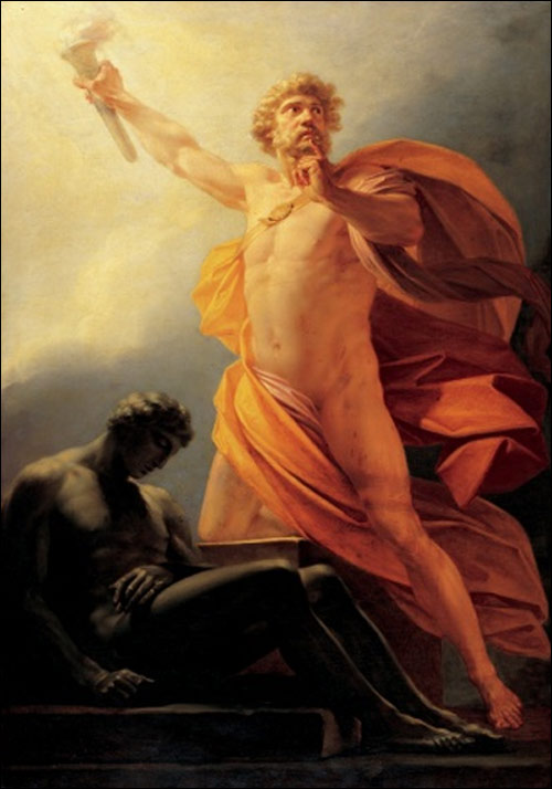
“Do not let your fire go out, spark by irreplaceable spark in the hopeless swaps of the not-quite, the not-yet, and the not-at-all. Do not let the hero in your soul perish in lonely frustration for the life you deserved and have never been able to reach. The world you desire can be won. It exists… it is real… it is possible… it’s yours.”
—Howard Roark, The Fountainhead
Whiskey Tango Foxtrot
Welcome to my blog about academia, working with students and thoughts on design. I need a place to display the wonderful work my students create. Teaching is a two-way street.