This video is greatly sped up. Be sure you take your time and be mindful. The first part is making an achromatic value scale and the second part is making a chromatic value scale.
One of our first assignments in color theory class is to create a value scale. Here are a few tips: Use clean brushes, change water often, use clean mixing tray, don’t use too much water and to avoid streaks, mix enough paint to apply two coats of paint perpendicular to each other.
Before moving from black and white to color, we explore the tones between white and black. How many steps are there? In graphic arts technology, printers use 10 that they can hold with their presses: 1 white, 8 steps of tones then solid black. How many can the human eye perceive?
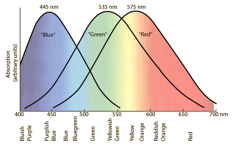
Human eyes have two photoreceptors: rods and cones. We have about 120 million rods that perceive only black or white and about 6 million cones that perceive color. Cones are less sensitive to light and can be divided into red (64%), green (32%) and blue (2%) based on measured response curves.
Some people can create 23 or more steps between black and white by mixing black into white acrylic paint pigment on white illustration board. We typically paint a rectangle of illustration board white then paint one black and try to get as many steps as possible between. After that exercise, we move to image creation. Who has not felt joy when viewing a beautiful black and white silver photograph with a full range of tones?
We play with image capture by painting with only white or black paint. Here are some student examples. Many students have never painted before but seem to enjoy this exercise anyway.
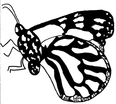
Development of a singular form found in the natural world rendered in only black and white. Here students explore how to create a well designed form using only black and white. A precursor to logo design. All good logos need to be able to exist in B&W with no tones.
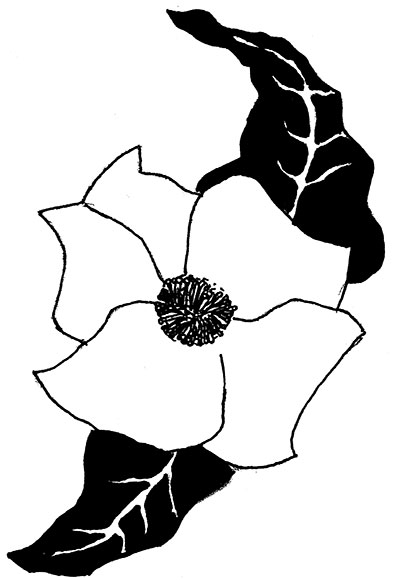
Below are student examples of pen and ink on hot press illustration board. Some of the line work is a little shaky and they could benefit from using French curves but they are working with organic shapes and ink for the first time.
The principles of good design are the tools used by an artist or designer to create an effective composition or design. The principles are: balance, movement, repetition, emphasis, simplicity, contrast, proportion, space, and unity. The difference between a weak design and a strong one is completely dependent upon the artist’s knowledge of the design principles and how well he/she applies them. Exploring each of these principles in a series of art lessons is a worthy endeavor.
In the study of design, we note there is no longer a clear-cut line between fine art and applied art anymore. All art, whether it is web design, industrial design, fine art, sculpture, commercial art, or graphic art, is subject to the same principles of good design. Graphic artists compose their designs and page layouts using the same design principles the fine artists use. Just as a fine artist arranges various components within a painting to create a pleasing composition, so it is with the graphic artist. The artist may use a vase of flowers, a bowl of fruit, or a figurine to design a lovely still life composition. The graphic artist will use headlines, bodies of text, photos, and illustrations to compose a page or web site.
The basis of all design is the arrangement of the elements of a work of art, using the design principles. It is the bringing together of various components into one area and arranging them in such a way as to create a composition, layout or design that is both unified and pleasing to look at. For example every artist, whether they realize it or not, is familiar with the elements of a composition. These are: • Line – an actual or implied mark, path, mass, or edge, where length is dominant • Form – the mass of the shapes • Texture – the structure and molding of a surface (rough, smooth, etc.) either actual or illusory • Value – the degree of lightness or darkness of a given color • Color – a pigment or hue • Shape – any flat area bound by line, value, or color
The elements are what the artist uses to create a composition. But it is HOW the artist brings these elements to together and arranges them upon the surface of a canvas that creates the composition. A design is the result of the application of the principles of design. Please note that the use of the word design is synonymous with the words layout, composition, or work of art. Wucious Wong refers to the edges of the canvas or paper as the “framal reference” or frame of reference. A good composition is where the elements fit inside the frame in a pleasing manner. The removal or shifting of any of the elements would case the composition to weaken.
The principles of design, sometimes referred to as the principles of organization are: • Balance – a feeling of equality of weight, attention, or attraction of the various elements within the composition as a means of accomplishing unity • Movement – the suggestion of action or direction, the path our eyes follow when we look at a work of art • Repetition and rhythm – the act of repeating an element either regularly or irregularly resulting in a rhythm of the repeating elements • Emphasis – the stress placed on a single area of a work or unifying visual theme • Simplicity (a.k.a. visual economy) – the elimination of all non-essential elements or details to reveal the essence of a form • Contrast – the difference between elements or the opposition to various elements • Proportion – the relation of two things in size, number, amount, or degree • Space – the interval or measurable distance between objects or forms (two dimensional or three dimensional) • Unity – the relationship between the individual parts and the whole of a composition
Many artists use these principles more intuitively than intellectually but are nevertheless subconsciously aware of them and their impact upon a composition. A seasoned creator of visual communication or visual delights may not even be aware that he or she is using the above principles. They become seemingly innate as they are practiced over and over.
Good art always starts with an idea even if that idea is a feeling.
Before beginning any work of art every artist or designer needs to keep in mind that every composition starts with a concept. To use the design principles effectively it is necessary that the artist have an idea to express or an objective in mind. This is vital to the success of any art work. Without an objective, the most conscientious attention to balance, movement, emphasis, contrast, proportion, and space to create a unified composition, will result in uninteresting work. With an idea, however, even though the principles may be forgotten and used intuitively, a beautiful composition may emerge. Every artist’s goal should be to create a composition that is both unified and interesting to look at for more than a millisecond.
“I believe in intuitions and inspirations. I sometimes feel that I am right. I do not know that I am… [but] I would have been surprised if I had been wrong
“I am enough of the artist to draw freely upon my imagination. Imagination is more important than knowledge. Knowledge is limited. Imagination encircles the world.”
Before sending a proof to client or sending art to the printer:
• Run spell checker
• All files need to be in CMYK mode before sending files to the printer and making the press-ready PDF./X
• Photos in CMYK, saved as a .tif file an properly placed (command + d) in InDesign or (command + e) in Quark
• Exception to the above rule is if you are using a “book-on-demand” printer like iBooks or Flickr, they usually have a color conversion table file for their digital presses. Always check with your printer if you are in doubt.
• Another exception would be if you are going to a display maker (signage) although many of these have conversion files OR if you want a giclée or photographic print. Ask.
• Since RGB files have a broader color range, it is a good idea to preserve the original RGB version and/or retouch in RGB and then convert at the last minute to CMYK. (Two files, RGB version and CMYK version because most will be used for both web and print). Color calibration is a big deal.
• Just about all magazines and newspapers only accept press-ready PDFs and files must be in CMYK, Grayscale, or B&W. Most of them have specification sheets for you to make sure you are building the files correctly.
• Build the “bleed” into your art in Photoshop or Illustrator then set-up the InDesign file to the “trim” size. Bleed is usually an eighth of an inch beyond the trim so if you do not want to risk a white line showing when the piece is cut out, and you want the art to bleed off of all sides, then add one quarter of an inch to the trim size.
• In InDesign, pull the art box beyond the trim size to allow for bleed.
• When you make your PDF, make sure you specify bleed and crop marks so it will show up for the printer. Making a PDF is an essentially an electronic printing mechanism. Double check it by opening and examining the “print.”
• If you insist on placing your photographic files in Illustrator, make sure they are properly embedded when you export to .eps or .pdf. Again, make sure they are CMYK, too.
• Placing a .psd file in Illustrator then placing that file in InDesign will not properly package all the links. Manually, make sure all the images are available for the printer if they did not gather into the “links” file.
• Having layers makes for bigger files. You must keep your type on a layer in Photoshop to keep it “vector” sharp or “live” and editable.
• Even if an image looks like it is B&W, it could still be in another color mode—especially if you downloaded it from the web. Web images are usually in RGB. A B&W photographic image for printing in one color (black) must be in Grayscale mode. Logos coming out of Illustrator (.eps) must be black.
• In preparing the die-cut template for boxes, envelopes, folders or any speciality folding thing like Point of Purchase displays, the solid lines indicate “cut” and the “dashed” lines indicate fold.
• The amount of color or tint that will show, depends on the paper on which it is printed among other things. Gloss paper will hold a finer tint and have less dot gain. A 2% screen tint will not show up. Similar issue with super fine lines such as a hairline rule… disappears! 10% is standard tolerance.
• Newspaper ads do not have a bleed like magazines. The way newspaper are printed, they have a built in edge for the gripper so build your ad to the full specification size.
There is always more… These are just some thoughts while reviewing your projects. Happy Summer Fun!
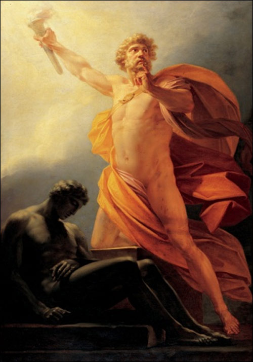
Prometheus Bringing Fire (Spark of Reason) to Mankind by Friedrich Heinrich Fuger, 1817.
“Do not let your fire go out, spark by irreplaceable spark in the hopeless swaps of the not-quite, the not-yet, and the not-at-all. Do not let the hero in your soul perish in lonely frustration for the life you deserved and have never been able to reach. The world you desire can be won. It exists… it is real… it is possible… it’s yours.”
—Howard Roark, The Fountainhead
Welcome to my blog about academia, working with students and thoughts on design. I need a place to display the wonderful work my students create. Teaching is a two-way street.